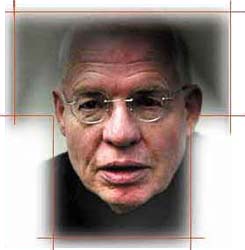
Paul Lloyd é, para mim, um dos grandes tipógrafos revivalistas digitais, ao lado de Dieter Steffman, Manfred Klein, Pia Frauss (infelizmente pequena produção), Nick Curtiss e David Nalle (Scriptorium). Aqui vão as palavras do proprio sobre sua fonte Clerica (download aqui). Este artigo é o início de uma discussão mais ampla que envolverá a escrita chancelaresca/itálica, copperplate, minusculas de Arrighi, Bruce Rogers... (foto: Manfred Klein)
Clerica I don't know the exact source of the scan I derived Clerica from- I've accumulated a large library of interesting samples, scans and so forth over the years and I'm not sure of exact sources. I've accumulated everything from old type samplers, interesting product labels, friends hand lettering, advertising handbills, my own handwriting etc etc etc.....Clerica is a font based on something that came somewhere out of that lucky dip, constructed by the tried and true method of scanning and tracing to create a template, which becomes a rough guide to build the finished font around, many hours spent on hand constructed curves! Enjoy the finished result as much as I enjoyed the process! The idea behind Clerica is a computer font that doesn't look like a computer font. The idea is to remember when people had an instinctive ability to write legibly on the page, new technology put to the service of old, there again the latter is what most of my fonts are about really! Paul Lloyd
TEMA RELACIONADO NESTE BLOG
tagliente, palatino, arrighi
Nenhum comentário:
Postar um comentário