a questão da classificação das tipografias, como quaisquer problemas de classificação na ciência e na arte, é sempre motivo de discussões entre as diversas correntes de poensamento envolvidas. aqui vamos reproduzir a classificação utilizada pela Monotype Imaging em seu site Fonts.Com.
longe de ser uma rigorosa classificação técnica e tradicional esta classificação na verdade atende ao objetivo de elucidar caminhos para o cliente de tipografia, que no mais das vezes não é nem deveria ser, um expert
portanto, passa ao largo das classificações acadêmicas que temos por aí, mas preenche muito bem os requisitos a que se destina.
desta transcrição a seguir retiramos umas poucas classificações relacionadas a escritas poucvo conhecidas, como Devanagri, Thai e outras.
 Antique
Based on typefaces and handlettering of the past. Like Dovtrina Christam Concani 1622.
 Art Deco
Influenced by Art Deco design, like GansTitania.
 Art Nouveau
Influenced by Art Nouveau design, like Pingente.
 Blackletter
Designs based on the earliest types cut in Europe, like ScotoKobergerFrakturN9 and N11
 Brush
BrushLetters appear to have been painted with a brush Calligraphic, like Malbeck.
 Capitals
Designed for titling and display uses, these typefaces contains all capitals, like Volitiva
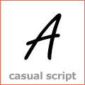
 Casual and Casual Script
Designed to look informal, as though quickly drawn with a brush, pen or similar writing instrument. Casual Script is a script with a friendly, informal, sometimes handwritten appearance, examples: GFY Handwriting Fontpak and PIXymbols Casual.

 Central European
Support Central European languages such as Croatian, Czech, Hungarian, Latvian, Lithuanian, Polish, Romanian, Slovak, Slovene, and German. Turkish is supported with extra fonts provided within the CE font package. MyFonts.Com site speeches: "A font containing Central European Latin-based diacritics. Supports Latin-based languages of Central Europe such as Croatian, Czech, Polish, Slovak, Slovenian as well as Hungarian. The characters may only be accessible in Unicode-savvy applications. The Unicode Standard is an international, cross-platform standard for encoding of digital text. Unicode-compatible fonts can include up to 65,535 characters from any language known to humankind. They can be used in modern operating systems such as Microsoft Windows 2000, XP, Vista, or Mac OS X, and in modern applications such as Microsoft Office 2000 or higher, Adobe Creative Suite, QuarkXPress 7 or newer, Corel Draw 10 or newer, Macromedia MX 2004 applications. Earlier versions of these systems or applications may not support Unicode. Examples: Adagio Pro and Akzidenz-Grotesk® BQ.
 Chiseled
Based on carved or chiseled letterforms, like Volitiva Open Face series
 Clarendon Serif
Strong vertical weight stress; usually with heavy, bracketed and square-cut serifs, like Vengeance.
 Computer Related
Typeface is designed for computer-related purposes (such as numerical scanning or optical character recognition) or is designed to resemble typefaces that were created for these purposes, like Orbit-B.
 Condensed
Characters are compact or condensed in proportion, like GansItalianaCondensed.
 Contrast-Low
Very little variation of thickness between character strokes
Contrast-High
High variation of thickness between character strokes
 Copperplate
Elegant script typefaces based on18th-century handwriting, oftentimes featuring bold flourishes, like CopperplateDecorative.
 Cyrillic
Support the Belorussian, Bulgarian, Macedonian, Russian, Serbian, Serbo-Croatian and Ukrainian languages, like Cyrillic Latino.
 Decorative
Unusual or ornamental faces, sometimes using unorthodox shapes and proportions for distinctive and dramatic results like Paulus Francke 1602, a barocke marvelous set.
 Engraved
Based on or inspired by typefaces originally engraved into stone, like Volitiva Open Face series.
 Engravers Inspired by engraved ""social"" printing."
 Formal Script
Derived from 18th-century formal writing styles; many letters have ""joining"" strokes, like Duet DT.
 Garalde, based on the letterforms from the master Garamond, like FrancescoDecorative. Most simillar inshapes and historic age is the Venetian Style.
 Geometric Sans
Letterforms are based on simple geometric shapes, like Orchis.
 Glyphic
Distinguished by triangular shaped serifs or flaring stroke ends, like Caslon2000.
 Grunge
Contains letters with a weathered, worn, or grungy appearance, like GeodecPetrasEnhanced.
 Grotesque Sans, Contrasting stroke weights and a slightly “squared” quality to many curves, like Estiliza.
 Hand-tooled
Letterforms appear to be chiseled, carved through the introduction of a negative highlight on the left edge of each character, like GrasVibertHandtooedCapitals.
 Handwritten
Letters have the appearance of handwriting, like Wendy.
 Humanistic Sans
Based on proportions of Roman inscriptional capitals & Renaissance small letters, like IntellectaRomanaHumanistica.
A collection of symbols designed for specific representations, like WorldWarWarplanes.
 Images & Symbols
Fonts that contain images and symbols in place of letterforms, like the fantastic TTF TATTOEF series.
 Initials
Letters used primarily as decorative beginnings for paragraphs or document sections, like IbarraDecorative.
 Inline
Typefaces with a highlight running through each letter, like GansTitularAdornada.
 Lombardic Script,
Ornate, calligraphic display designs based on medieval forms of manuscript lettering,like GansAdorno.
 Modern
Abrupt and dramatically contrasting stroke weights and little or no serif bracketing. Terminals are “ball-shaped” rather than reflecting a broad pen. Despite its name, this typeface style emerged in the 18th century, like IntellectaBodoned.
 Monospaced,
All characters have the same width. Particularly useful for setting text on forms, and in other instances where exact and consistent spacing is required, like Volitiva.
 Neoclassical & Didone Serif
Abrupt and dramatically contrasting stroke weights and little or no serif bracketing. Terminals are “ball-shaped” rather than reflecting a broad pen, like GraveOrnamental and GrasVibert.
 Old Style Serif
Normally left-inclining curve axis with weight stress at about 8 and 2 o’clock; serifs are almost always bracketed; head serifs are often angled, like GansIbarra, a historical typeface.
Old Style Figures,
 Ornaments
Contains decorative ornaments or symbols that can be used to embellish or decorate, like RoughFleurons.
 Outline,
Outline of the typeface is visible, but the rest of the character is unfilled, like Carbono.
 Sans Serif
A typeface without serifs, like Estiliza.
 Script
Imitates a variety of handwriting techniques, sometimes with ajoining letters, like Maryan, a beautiful font.
 Slab Serif
Imperceptible or subtle stroke weight changes and characters with very heavy serifs, like GansItaliana.
 Square Sans
Definite and sometimes dramatic squaring of normally curved character strokes, like GansLathModern.
 Stencil
Letters have a hand-stencilled appearance that includes gaps running through each character, like GlaserStencil and AG Book Stencil® BQ.
 Symbol
Contains images and graphics in place of letterforms
 Transitional,
Somewhat pronounced weight contrast, with bracketed serifs and oblique head serifs; rounded letters generally have a vertical stress, like IntellectaRomanaHumanistica.
 Wide, Characters are extended or wide, like GeodecSpyral.
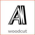
 Woodcut
Letters look as if they have been carved out of wooden printing blocks. See here dingbats and letters from woodcuts, like ScottishVignetes.
 Non Latin
Contains a non-Latin based character set. Examples of non-Latin fonts are Greek, Cyrillic, Hebrew, Romanian, Arabic, Armenian, Baltic, Hindi, Chinese (ideograms). See too Multilingual: Fonts that support languages using Latin, Cyrillic, Greek, and Armenian scripts.
 Greek, Contains a character set specified for the Greek language. May be used with either Western European or localized operating systems.
 Para informação acurada sobre as escritas e tipografias não-latinas ou latinas orientais veja a classificação do MyFonts aqui.
Existem ainda os caracteres fonéticos, para uso em dicionários e trabalhos científicos, eu suponho e os matemáticos, que dispensam aspresentação
no proximo post: Swash, Techno e outras...
no proximo post: Swash, Techno e outras...
Um comentário:
Parabéns pelo blog!
Um show de cultura!
Abraços
Mônica
www.monicafuchs.com.br
Postar um comentário